DarkArc007
Minimal design, maximum impact
Avatar
Sleek, minimal and a nod to vinyl, our avatar has landed
Everyone needs an online avatar in the digital age, and sister design studio FugaceFugace was on the case from the start.
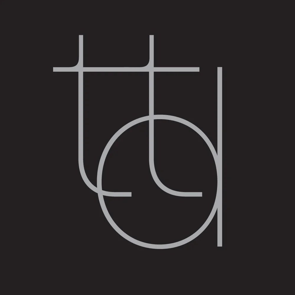
“We started out with sort of typical things,” says Rei, FugaceFugace’s creative director, reflecting on the initial drafts that involved writing out "tdt" in the standard NxN umbrella font. That original idea looked cool and everything, but it was a bit vanilla. There was something hiding from us, we think, just beneath the surface of the typography.
The breakthrough came when the team stopped looking at the characters as mere letters and started seeing them as structural geometry. They noticed the literal anatomy of the "t" perfectly mirrored the sleek silhouette of a DJ deck tone arm, while the curves of the "d" immediately suggested the spinning chassis of a classic turntable.
“Then the letters, they just fall together,” Rei explains, smiling at how naturally the mechanical imagery locked into place once the perspective shifted. “We’re very happy people can see the shape for themselves without us explaining it to them. It creates a subtle, inside nod to the culture we are building. It is much more fun than what we started with.”
The finished avatar stands as a masterclass in minimalist visual identity, transforming basic initials into a sleek, self-contained emblem for the digital realm.
By stripping away the clutter, FugaceFugace managed to embed the very DNA of our sound into a simple, high-contrast icon. It bridges the gap between raw hardware engineering and clean digital presence, giving the vault an immediate, recognizable stamp that feels both deeply intentional and effortlessly clever.
“The letters, they just fall together”