DarkArc003
Less maybe more, but even less is even better
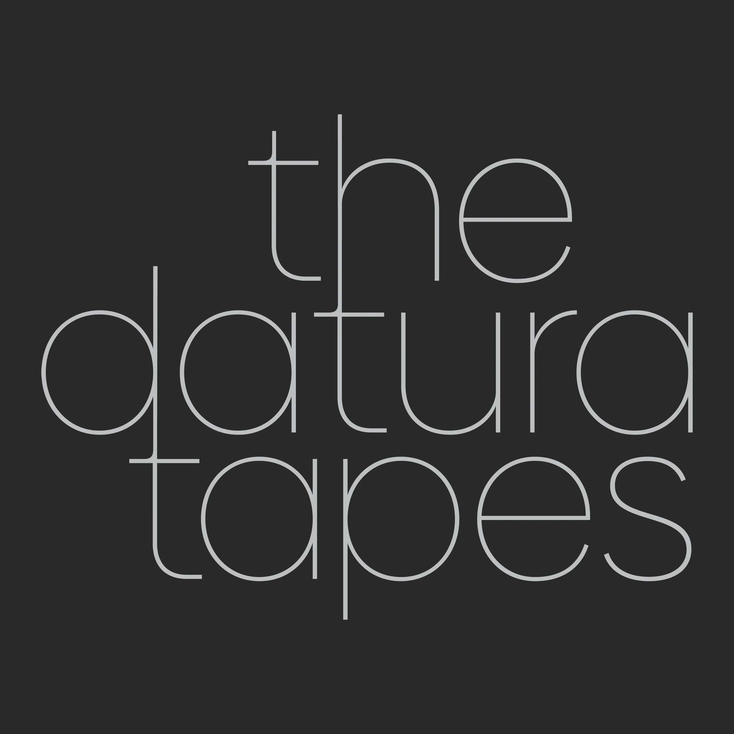
TDT LOGOTYPE
We give thanks to sister studio FugaceFugace from the I Live Night by Night Collective fo this simple and sure footed logotype.
“The Tapes? They chaos” says FugaceFugace creative director Rei Zarharne. “But also, strangely very focussed on the work. When they ask us to create they identity, we started very BIG you know, and all kinds of influences, like maybe Keith Haring or Jean-Paul Basquiat, very ‘pop culture as art’, but it did not work, it look great maybe, but we found it got in the way of what they do and who they are. They confusing enough ;-)”
“I mean their artists, the all look amazing right? All super different style and looks, all music like every record you love all at once, we could not find anything to represent such diversity. So we throw away, and away, and away, til we left with just these letters, this type. It is the font from ICJam, the content studio that kick all this off in Florence, what brought us all here and make us set up the I Live Night By Night (NxN) collective, it made to keep a single, simple strand of DNA. We can make everything else crazy, but we need a North Star to steer by you know?”
“We very big fans of Peter Saville at Factory Records, we should build a statue of him in the tudio. We knew we wanrted to number everything, it’ll be industrial in concept, so the super simple solution suddenly became obvios.”
“We would have argued forever if it was down to us, which is why I told Rei to do what she wanted and not to even speak to any of us about it and ignore anything we said” says Studio Head Mujiki. “Of course when she shows it to us, it’s like everything FugaceFugace does, it’s just…right.. We felt like a real label in the space of ten seconds.”
“Plus she did say, ‘this is it, this is who you are now, and I don’t want any of your bullshit’, so really, we didn’t have much of a choice.”
Logotype as linear version.
“We can make everything else crazy, but we need a North Star to steer by you know?”